mobile view editor different from actual

I've noticed others in the community with a similar problem but mine is slightly different I think.
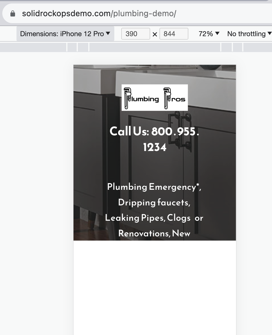
When I edit for mobile view it looks fine. When I look on my actual phone it cuts off the main image and text leaving a large white area. I looked at the site in developer mode with Chrome and it shows the same thing for all dimensions with slight variations in what is cut off.
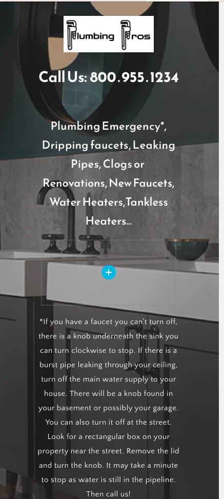
Not sure how to trouble shoot or what to change. The first is a screenshot of what I actually see on my phone (even though it's really from Developer mode in Chrome.) The second is what the brizy editor mobile view shows, which is normal.
I should add, this is the first time this has happened to me. Every other site has rendered correctly for me on the phone I was testing it with. Makes me think something is amiss with the template or that settings in that first block.
-

Hi Chris,
Thank you for reaching out to us.
I assume that you have applied the Animated Parallax effect to the background image. Unfortunately, this is an ongoing issue that we’re trying to fix.
As a temporary workaround, we recommend either using the Fixed Parallax effect or temporarily disabling the parallax effect altogether until we have an update to resolve this issue.Please try this and let me know how it goes.
Best regards,
Ariel H.0 -
Thank you Ariel. Yes, that was the problem. Will you notify when this is fixed? I do like that feature.
0 -
Hi Chris,
Thank you for the update.
I will provide further information as soon as I receive confirmation from our senior support team regarding the resolution of this issue.
Sorry for the inconvenience.
Best regards,
Ariel H.0
Please sign in to leave a comment.
Comments
3 comments