Table on mobile/tablet

Hey,
We have multiple tables on a page.
Here is the link:
https://bloomcoding.org/cookie-policy/
After shrinking the page under 992px width, the table columns shrink differently. The first column takes up more space than the others. The more we reduce the width, the worse it is.
It's very bad on mobile. https://prnt.sc/hbIoKD6ahyaz
On the desktop, each column took up 25%. How can I get this to be at any resolution?
Thank you in advance.
-

Hi Mihaela,
This seems to be a limitation with the Brizy Table element. When the sidebar is disabled, table columns have uneven widths on mobiles.
Please have a look at this page on a mobile. https://brizytest.online/table/ You can see that the columns are evenly spaced. Please consider this work around to implement your table with equal widths.
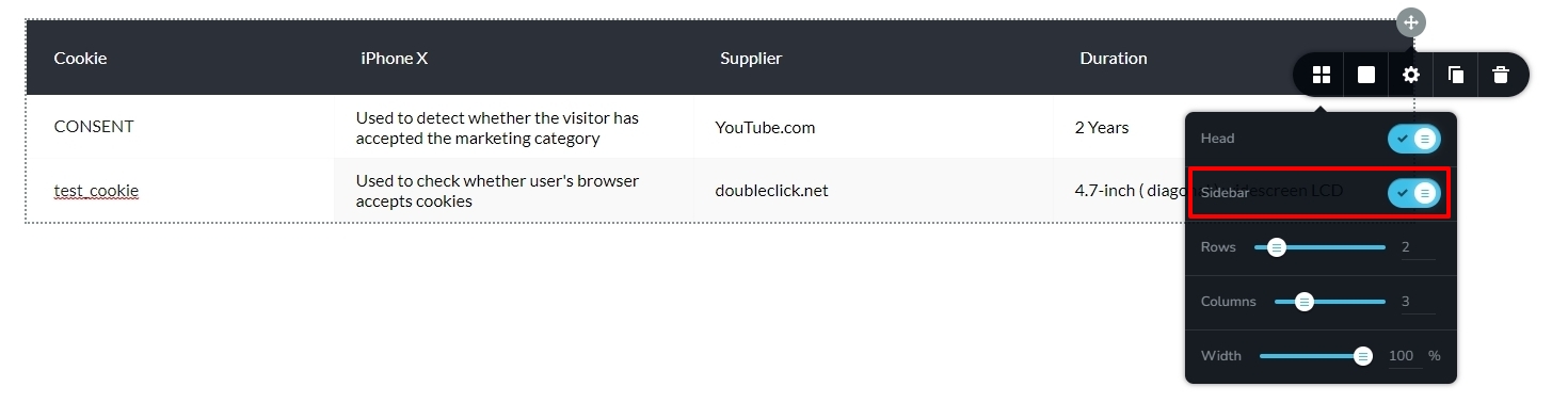
- Enable the Sidebar as seen in the first screenshot
- Shift the first column's content to the sidebar, the second column's to the first, the third column's to the second, and so on.
- Reduce the number of columns from four to three.
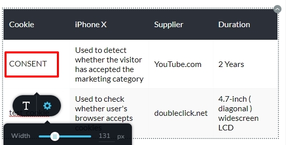
- In the mobile design view, click on the highlighted area in the second screenshot and adjust the width of the sidebar so that it is evenly spaced with the columns.
 1
1 -
Thank you, George!
It's a good solution to this problem.0
Please sign in to leave a comment.
Comments
2 comments