Mobile Menu CSS

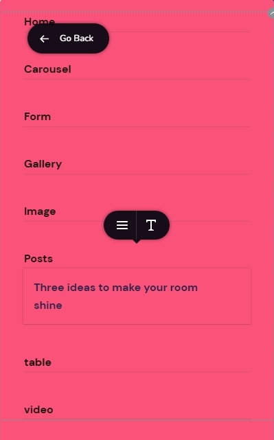
I have an issue with mobile menu the text is being cut off. I admit the page titles are long. See image. What adjustment with CSS can I make

-

Hi Ray,
The mobile hamburger menu does not support wrapping of sub menu text. To overcome this issue, please consider setting up your mobile menu using the Brizy popup builder. As an illustration, please check the mobile menu at https://digital-works.brizy.site/ Click on the below menu items which has a relatively long sub menus.
- Image
- Posts
- Table
Please have a look at the first part of this video for the procedure to setup a hamburger menu using the Brizy popup builder. 3 Ways to Use Popup Builders If you have questions about the procedure, feel free to get back to us. We will help you.
0 -
I don't really want to have to change is there an adjustment to padding etc. so it allows for a wider area within the menu container?
0 -
Hi Ray
You need a CSS to make the sub menu text to wrap around. Please add this to your Custom CSS
@media (max-width: 767px){
.brz-menu__ul--has-dropdown span.brz-span{
   white-space: normal;
}
}
PS: We normally do not provide CSS solutions as part of support.
0 -
Thank you for that.
In respect of CSS it has been supplied before on a number of occasions. Where Brizy fails due to missing functionality it should be always be supplied for those that inquire. Please pass on to Brizy management.
EDIT
I had another thought I can adjust the font size to make it fit. This also might help others.
0
Please sign in to leave a comment.
Comments
4 comments