Desktop and Mobile Views

Hello Brizy,
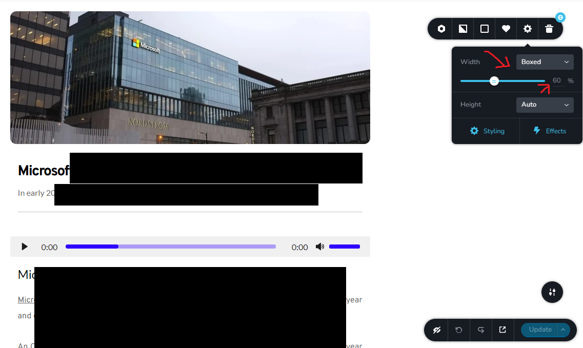
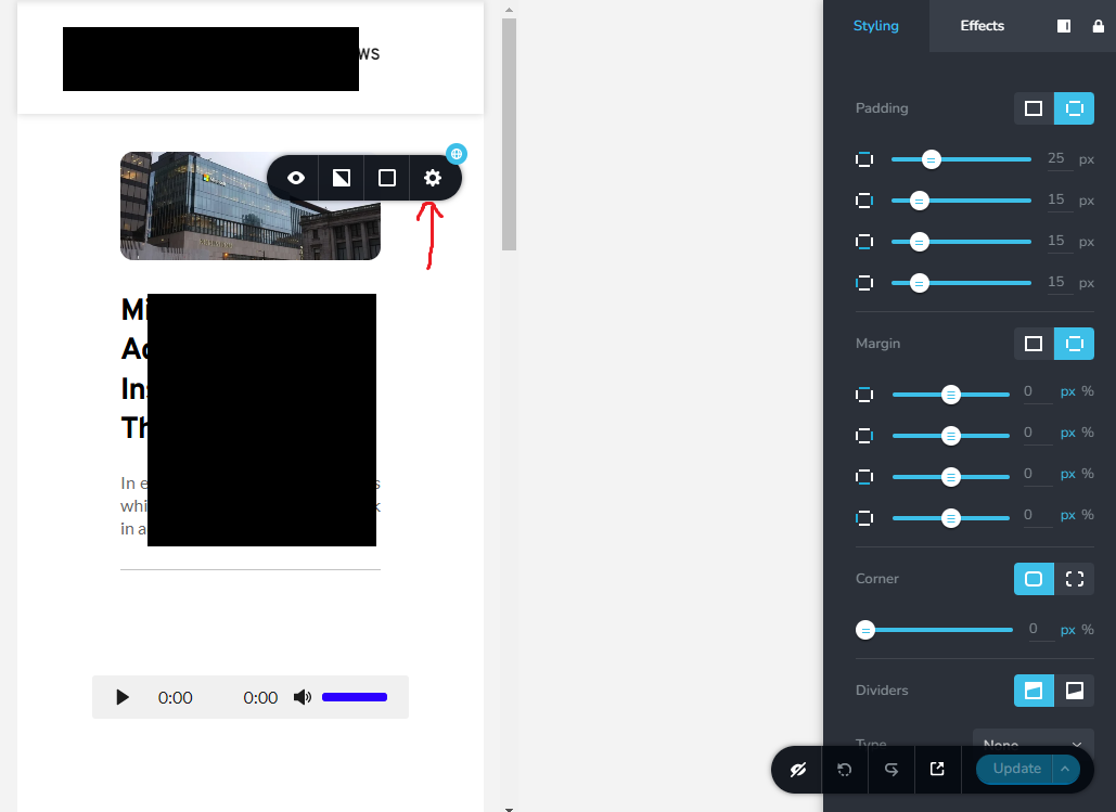
I have a global element that on the desktop has the perfect size (Boxed 60%) which is ideal for my website. But, when I switch to the mobile view, that 60% doesn't look good so I want to change it but the problem I am facing when I change it on the mobile, it reflects on the desktop, for instance when on the mobile I try to make it say 90% and then I switch back to the desktop, I discover the desktop is now 90% instead of 60%.
Desktop View:
Mobile View:
How can I fix this so they are not linked/synced?
Thank you
-

Hi Ahmed,
When you set a percentage width for a block for the Desktop, usually that applies only to the desktop and you should be able to set a different percentage width for the mobile block. Please have a look at this screen recording for how it is expected to work. https://jmp.sh/3tMCTplv
I would like to take a look at your project to see why this is happening. Can you invite me to your project as a Team Member? My email: kc.george@brizy.io. Please assign me 'Manager' role.
 0
0 -
Thank you KC, I tried it today and it's working for one block but not for the other, I will add you in on Monday, thank you and enjoy your weekend!
0 -
Hi Ahmed,
If you still do not have luck with other blocks, please send me an invitation. I will be happy to take a look.
0 -

I have a requirement for this function. Currently Brizy only allows to set the width limit as %. I want to allow exact width (px). I could add css to do this, but you guys should add this functionality.
On a screen size of 14 inches, the design looks good. But when I view on the screen size of 20 inches, everything looks very ugly.
The visible area is limited to a fixed width (px).0 -
Hi Vantrinh,
Are you saying that setting the page width to a pixel value would make your website more responsive for different screen sizes? If you would like a page to look similar in 14 and 20 inch screens, width should be set in percentage and not in pixels.
Can you please clarify your request?
0 -
When setting width %. On large screens, the elements will be very far apart. there are large gaps between elements horizontally.
I have 2 columns, the left column contains 10 lines text. Right column 500 x 500px image. Everything on the 14 inch computer is perfect (I set the width to 80%).
When the web is displayed on a 17-inch screen, the column widths increase dramatically and my block of text has only 4 lines instead of 10 lines.
There will be a big blank space in the column containing the text, the design of the website will look terrible.
I usually use css to fix the maximum allowed width.
@media (min-width: 991px) {
.NameClass_xxx .brz-width-content {
max-width: 1200px! important;
}
}(The class name may be incorrect). This way works fine for me. But it should be an inbuilt function, the user has the option % or px
0 -
Hi Vantrinh,
I will make a request for a feature to set the container width for the boxed width option.
0
Please sign in to leave a comment.
Comments
7 comments