Table Element

Hi,
The table element seems to be having issues in Brizy 2.4.12 and Brizy Pro 2.4.11.
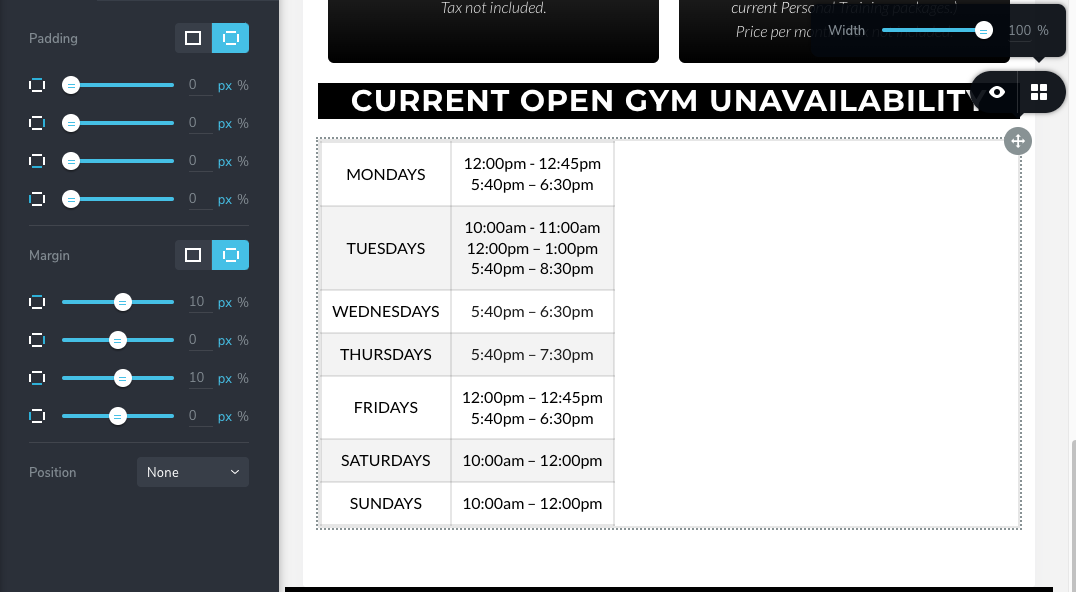
When the table is 100% on desktop it doesn't make it 100% width in Tablet and Mobile. Take a look at the screenshot.
Is this a known bug?
-

Hi David,
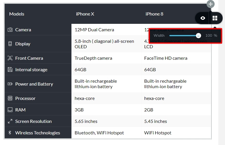
With the most recent Brizy updates, I tested the table element. At least at my end, the width looks accurate in both tablet and mobile views. You can see my test page here. https://brizytest.online/table
Please increase the width of the table in tablet and mobile views to 250-300% to fix the issue for now.
 If you want us to take a look at your project to try and find a better solution, please let us know.0
 -
Hi KC George,
Strange, I have tried it on 3 different sites of mine and they are all having issues with Tablet and Mobile.
The issue only seems to happen when you turn off the 'Head' and 'Sidebar' option. Can you try that your end and see if you see the issue.
200% or 300% doesn't make a difference.
Someone else reported this issue on the Facebook Group and said its been a problem for a while.
Thanks, David
0 -
Hi David,
The table element appears to display the correct width on tablet and mobile at my end even without the 'head' and 'sidebar'. Please have a look at https://brizytest.online/table
If you want me to take a look at one of your projects where you are facing this issue, please add me as a user to your WordPress Dashboard. My email: kc.george@brizy.io. As shown in this screenshot: https://jmp.sh/sOSGGR3, please turn on the option "Send the new user an email about their account"
Please also mention the URL of the page where you are facing the issue with the table element.
0 -
Hi KC George,
I added you to a test site of mine.
The table is on the page 'Brizy Support' I have switched all plugins off and using the Twenty Twenty-One theme.
Let me know if you have issues.
David
0 -
Hi David,
Please have a look at the test page with a Brizy table at https://testground.nerdhousedesign.com/ I have activated all plugins. The table has no width issues on a mobile or a tablet
 0
0 -
Hi,
I noticed you have done something with the desktop view, now I can't edit the settings as they are off the screen.
Also, if I change the wording to one word per column/row it errors in tablet and phone. Take a look, I changed the text to just 'hello' and the issue is there.
It seems unless I have 2 lines of text in a column, the width on tablet and mobile messes up.
David
0 -
Hi David,
You are right, when the content is limited and when there is a lot of empty space in the table, the table gets aligned to the left and does not occupy the full width in tablet and mobile. I will report and we will work on fixing this bug.
As a temporary solution, please reduce the width of the table; this can bring the content to the centre. Please have a look at the page now. https://testground.nerdhousedesign.com/
Some of the plugins were creating a conflict with Brizy. When all plugins are activated, the Brizy editor seems to misbehave. If you keep the plugins deactivated, you can edit Brizy pages normally.
0 -
Hi KC George,
Thanks, instead of using the table I created what I needed with columns. Once the table is fixed I will switch the design.
The website you have access to is nothing more than a test site. I test new designs and plugin there before going live with clients.
Thanks for going through this with me and finding the fault. Hopefully it gets fixed soon as it seems to have been an issue for a while according to the Facebook group.
David
0
Please sign in to leave a comment.
Comments
8 comments