Tablet Menu and Mobile Menu

Hello,
I just purchased the white label plan and I tried putting together a website today. I did ok however, I am having a real hard time with the menus on the Tablet and mobile views.
Here is the site https://boysenberry14279610.brizy.site/
How do I get the mobile view to look like the one below? For the life of me, I can't get it to line up and work properly.
Also, how do I get the tablet menu to function like the desktop version in landscape? Very confusing.

Thanks,
Chris
-

Hi Chris,
Please have a look at this video on how to set columns for the mobile and tablet designs. https://youtu.be/Vkbf90A275A
After watching the video, if you still need help in designing your mobile header, I will be happy to implement a design similar to your reference website for you. I can also record a video so that you know how I have implemented it.
0 -
Hi KC,
That makes sense to me, however looking at the mess I have with my menu on tablet and mobile, I have no idea where to even begin. Can you do a video using my site as an example and how you would create the menu for this site I tablet and mobile?
Thanks! Best,
Chris
0 -
Hi Chris,
Since you would like to rearrange the order of elements in your header for mobiles and tablets, I suggest you create one header for the desktop and another for the tablet and mobile. With this approach, it would be easier to make the header design responsive. Please watch this video for the procedure. https://jmp.sh/py0UIOuq
1 -
Hi,
That helped and I did it. But do I have to update the menu on all the pages for the different platforms after that? It doesn't carry over from there. At least what I have noticed. Please advise.
Best,
Chris
0 -
Another question is I have no idea how to edit the mobile menus after I hid them on the Desktop view. When I try to edit them in Tablet or Mobile I can't link or add elements to that section.
Best,
Chris
0 -
Hi Chris,
You don't have to update the menu on all the pages for the different platforms. To ensure that the same header is made available to all pages, you typically set your header as a Global Block. Please view the following video for further details on how to set a block as global: https://youtu.be/JhHwgwDfUQU
Under CMS- Project Settings - Menu, menus are created and updated centrally. The desktop header and the mobile/tablet header both have the same menu added. Therefore, you do not need to update the menu for each individual device.
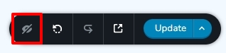
By selecting the "eye" icon in the bottom right corner, you can reveal all hidden blocks.
 0
0 -
Ok. Thanks. one more question...I made the Desktop menu global however when you move off of the home page the menu doesn't function the same with rollover colours as it does on the home page, which is what I want for all the pages. Am I missing something? How do I make the menu function the same on all pages?
Best,
Chris
0 -
Hi Chris,
At my end, your menu colors appear identical on the home page and other pages. I don't see any difference. Please look at the following screen recording of my test: https://jmp.sh/14OEpq82
0 -
I figured it our after I sent the message. Thanks!
Best,
Chris
0
Please sign in to leave a comment.
Comments
9 comments