How to make mobile responsive blocks

I am creating a template and designing it for desktop. When I click the mobile option here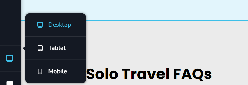 I find if I edit the mobile blocks, it then alters the desktop version too.
Is there a way to make edits that only edit the mobile display. 80% of users visit via mobile, Google tells us to think Mobile first - but I can't see any sign of how we make unilateral mobile independent edits.
The feature must exist, you wouldn't have neglected that, but finding the information on how to do it seems oddly difficult to locate. Can we 1. Know how to do this please and 2. Encourage you to consider adding tooltips to make things easier to find.
Thank you
-

Hi David,
If you make changes to your content like heading, paragraph or a button text in mobile design view, it will also change in the other two devices. However the styling changes you make in the mobile design view would apply only for mobile devices. Similarly, styling changes made in tablet or desktop design views will only apply to the respective devices.
Please watch this video tutorial on Brizy responsive design. https://youtu.be/ElFigw5ROLc Please let us know if your experience with Brizy is different from what you see in the video.
0 -
Thank you - I appreciate the reply
0
Please sign in to leave a comment.
Comments
2 comments